Week 3 Initial Prototype
Research Statement
I’m researching the intuitive responses people have toward vulnerable emotions like crying and how these reactions are influenced by cultural biases, and exploring how societal perceptions of vulnerability shape emotional expression and personal growth. Through interactive installation, I look into the tension between holding back and embracing emotions, showing how acknowledgment fosters resilience and transformation. Using animatronics and projection mapping, I visualize these dynamics, showing how societal biases discourage openness while emotional acceptance leads to renewal. My work challenges the notion that being strong means keeping back emotions, and encourages a deeper reflection on authenticity and the power of vulnerability.
Projection Mapping Test
Here are the insights and challenges I encountered while experimenting with projection mapping. One of the first issues I met was forgetting to start recording my set up process. Also, I had planned to use OBS to capture my TouchDesigner workflow, but after connecting the projector, I didn’t double-check my OBS settings. As a result, only a quarter of my screen was recorded, and key steps were missing. It is important to verify recording settings before beginning any session.
While designing the installation, I had to carefully consider how light interacts with the projected object. If an object is partially or fully blocked by another, or if it faces away from the light source, it will not receive the projection properly (Fig. 1). Viewing the setup from multiple angles is essential. From my working position, the projection appeared well-contained, but after finishing, I noticed that from the left side, light was leaking beyond the intended surface. It is necessary to assess projections from different perspectives during setup rather than just relying on a fixed viewpoint.
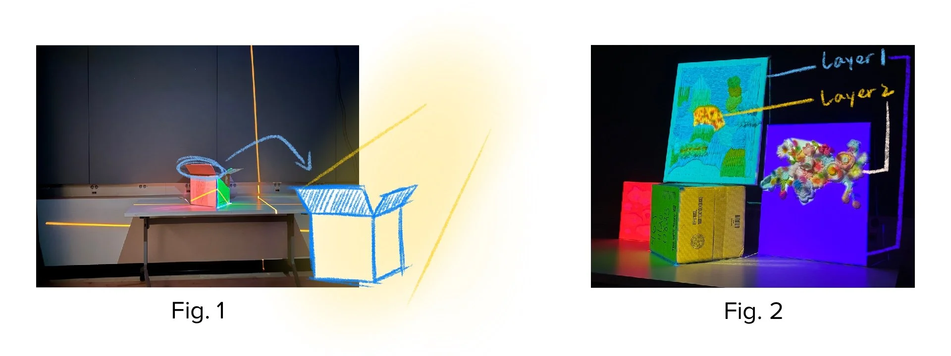
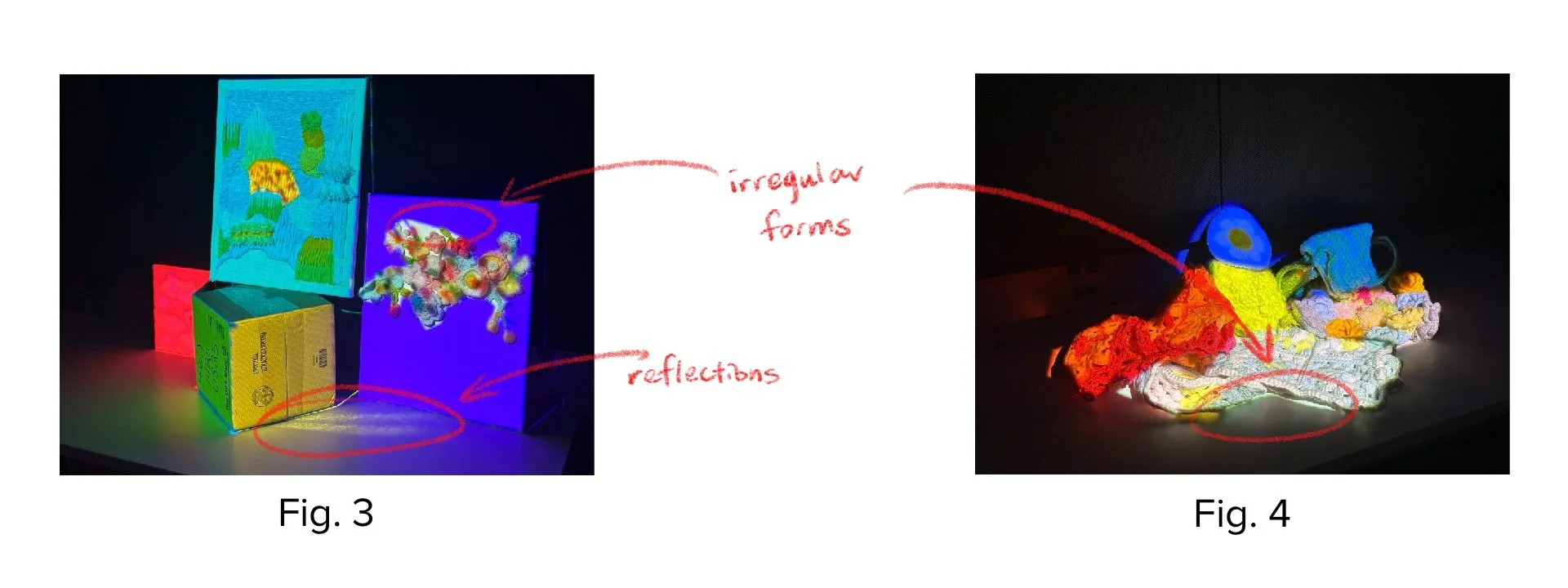
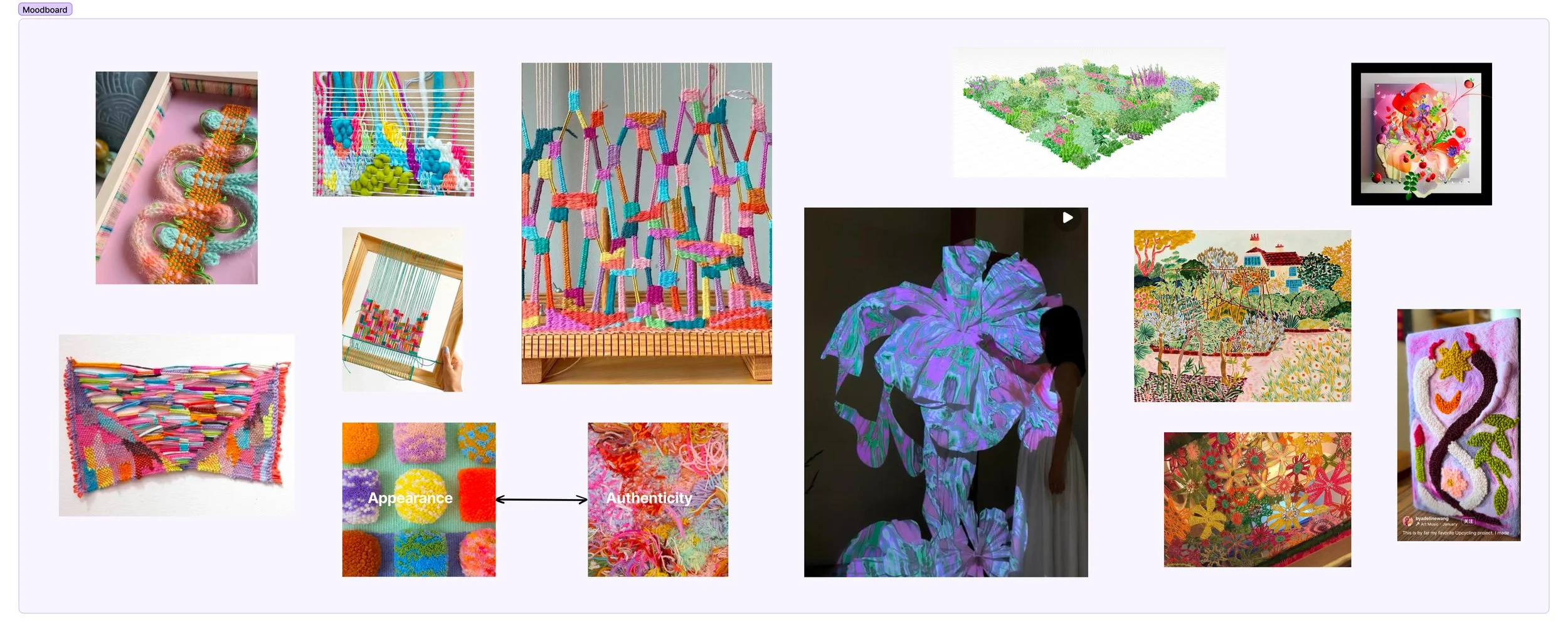
Layering is a useful technique in projection mapping. I was able to stack layers to create different effects, with an overall frame on one layer while highlighting specific areas with variations (Fig. 2). This approach allowed for greater depth and dynamic visual effects. Also, the surface and texture also played a significant role in the final presentation. The white office desk I used, with its smooth and reflective surface, caused unintended reflections (Fig. 3). In future setups, if a glossy table is used, it might be beneficial to lay down a tablecloth or explore other display to control reflections.
It is interesting that mapping on yarn surface works. When mapping onto a flat crochet or yarn surface, color choices became an important factor. Light-colored yarn worked well, allowing projections to display a range of colors effectively, whereas dark-colored yarn absorbed more light and diminished the visibility of projected images. Additionally, the organic shapes created by yarn required different mapping tools to better capture their irregular forms (Fig. 4).
Additionally, I tried mapping onto a mirror. A useful trick was to first shine a single beam of light onto the mirror to determine the reflection angle and position. Then, by flipping the mirror around and mapping onto its non-reflective surface, I could refine the projection before finally reversing it back to its reflective side. This method helped manage reflections and allowed for more accurate mapping onto the mirror's surface.
Moodboard
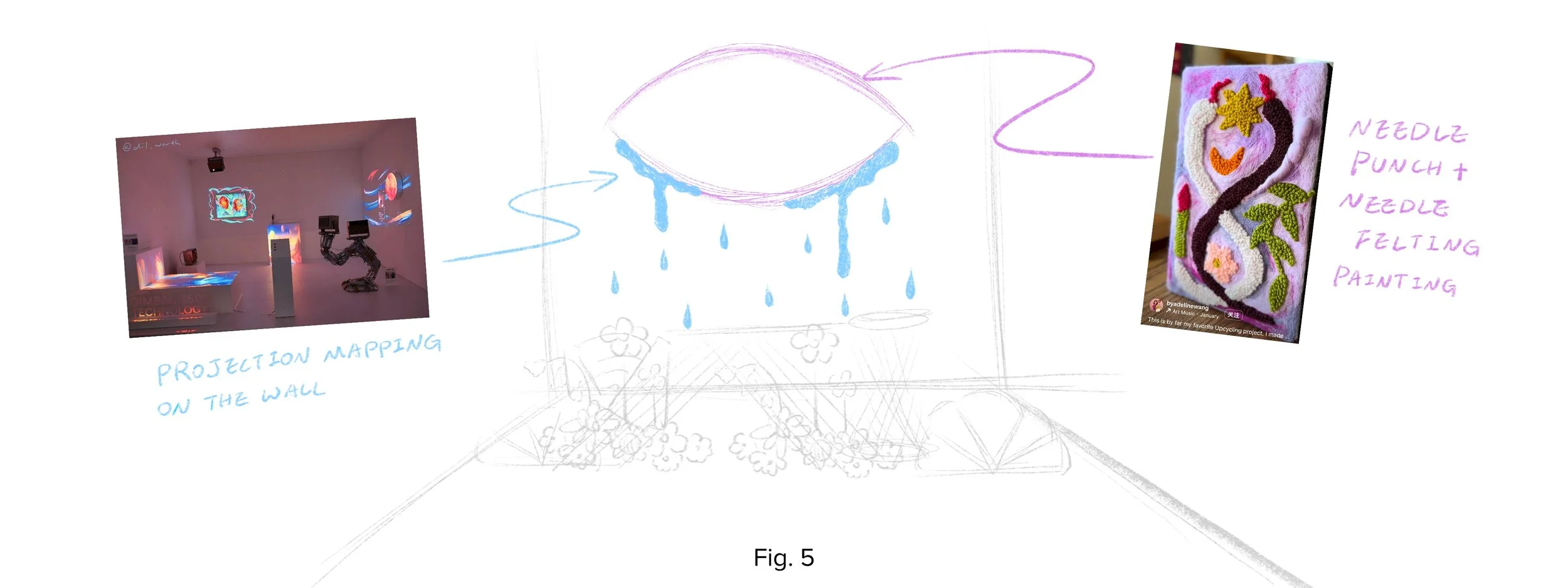
I chose yarn as the primary material for my installation because of its strong connection to my research on comfort objects, especially plush toys. Softness is a key feature that users deeply value, making yarn a fitting medium to explore this theme. Beyond its tactile appeal, yarn is incredibly expressive, it can be woven in order for a soothing structure or tangled into an unmanageable mess, evoking frustration and emotional tension. This contrast aligns with a key insight from my research that the contrast between intuitive feelings and deeper, more complex emotions. Additionally, yarn’s flexibility allows for various techniques such as crochet, knitting, and punch-needle embroidery, each creating unique patterns and textures that can represent a wide range of emotions and psychological states.
Installation Design
The installation features a large eye, with a felt painting hanging on the wall. At the beginning, an animation of tears flows from the eye, projected onto the wall around it (Fig. 5).
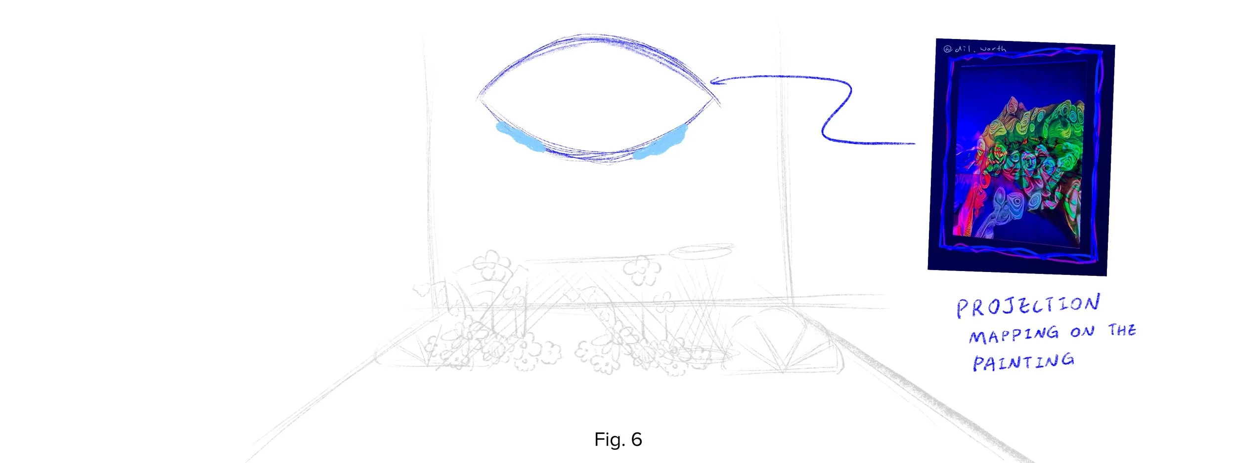
If the user chooses to "wipe away the tears", the projection shifts to reveal animations of societal biases against vulnerability, symbolizing the act of recognizing and facing these biases (Fig. 6). I’d like to create 10-15 second motion clips for each of five biases, including crying is a sign of weakness, happiness is the only acceptable emotion, men don’t show emotions, only visible struggles are real, and showing vulnerability invites harm. Each motion will visually represent and challenge these societal perceptions, encouraging reflection on emotional expression and authenticity.
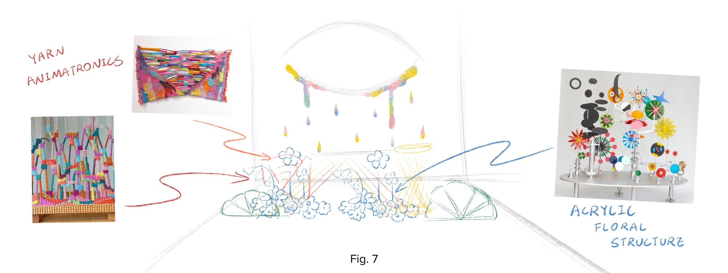
However, if the user selects "It's okay to cry", a soft light illuminates the animatronic plants in front of them. In response, the plants begin to grow, becoming more vibrant and full of life (Fig. 7). This transformation reflects the idea that tears, like water, nourish growth, showing that vulnerability has strength and can lead to vitality and renewal.
Questions
So far, for the user interaction, I plan to include two buttons: "Wipe Away the Tears" and "It's Okay to Cry". When a user presses a button, the installation will respond accordingly. However, the button-based interaction feels not adapted and disrupts the immersive experience. How can I make this interaction feel more natural and emotionally engaging?
One of my key considerations is why users would feel engaged to participate in the installation. In real life, when people see someone crying, they often intuitively comfort them, typically by saying, "What’s going on? It’s okay, don't cry." This response usually comes from a place of care, hoping to help the person feel better as quickly as possible. However, another option is simply allowing them to cry, recognizing that tears can be a necessary part of healing. How can I design an interaction that encourages users to respond intuitively at first, later reveal that another choice was possible?